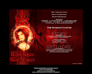
So what is this about, if you have decided to look further? A long time ago - the late 90's - I got into digital art as a result of acquiring my first computer in '97, and hence onto web design. I took a strong liking to certain new art being produced for the British comic 2000AD. This art was, I think, the first time traditional comic art had been combined with CGI in this title. It was distinctive, original and I loved it. I was already a fan of Durham Red as portrayed by Mark Harrison, in stories traditionally illustrated by paint, but the new look was something else entirely.
The Bloodshrine of Saint Scarlet
Early days... the very earliest version (not the one shown below) was amazingly clumsy in execution. And this published version hasn't aged at all well. At the time though, it didn't have much to compete against. All progress advances by degrees anyway: you have to set down markers in order to advance. And learn along the way. The whole exercise was a steep learning curve in learning Photoshop (also some HTML3) and how to design effectively. I remember absolutely hating the lowest common denominator approach that said you MUST design to a screen size of 800x600 pixels. This is the site, condensed into a thumbnail sheet. I'm too ashamed to show them full size - they really really really haven't aged well:
I divided the content into two sections: Art (Illuminatus) & Writing (The Shrine). The Shrine was where I put things like original scripts, references and other writing, Illuminatus for all the art. I had a lot of fun designing all the little sub-sections, each with themed content. About half the pages never got any content, just a backdrop. Of those that did, there was a costume gallery, appearances in 2000AD and covers, unedited scripts from the Scarlet Cantos, a monograph by Mark about Durham Red, and clickable layouts of production art reference. In hindsight, this project would have benefited hugely from some content collaboration. It never occurred to ask anyone else if they wanted to join in, such as the folk behind the Strontium Dog fanzine Dogbreath.
Since I was referencing and using a lot of Mark Harrison artwork, I worked on a website in parallel that featured some of his other work. The design went through a quite a series of iterations (learning curve again), the final version was live for a while (circa 2001). This is an example page:
The whole thing was coded very simply, essentially just a set of clickable image maps. Design wise this is too busy.
Before my computer got badly hit by a virus (circa 2003), I got as far as designing a new main page for a 'revamped' Bloodshrine, and also a new site for Markus. After the virus, life and stuff went all awry, so they never got fully realised.
Aiming for slicker, sparer design with these, to let Mark's art really stand out. None too sure about my 'branding' though.
Here endeth the shameless, self-promotional pimpage and trip down memory lane.
~J~


Your blog is a good one....
ReplyDeleteWebsite development and design form an indispensable component in creating a corporate brand identity for respective wedding firms. They not only promote the site, but also display a user-friendly interface with their attractive, informative and well-developed features especially built-in to suit every customer taste.
ReplyDeleteWeb Design Bangalore